Blog
Welcome

Recent posts
SEARCH RESULTS FOR: client sites

Our support team deals with photographers all day, every day. We know how people struggle with technology. And we think the software that professionals use can be part of the problem… making things worse, not better. How does this make sense? - Hosting your images with one provider, but your website somewhere else. Creating customer websites with a third provider, and mobile apps with a fourth. Designing albums with a fifth, and proofing them with a sixth. Branding your blog images with a seventh, but actually blogging somewhere else again! Each time there's another piece of software to To View More >>

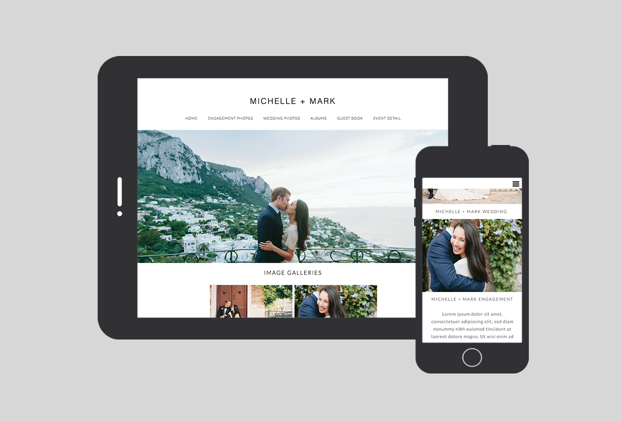
Here's how it works Assuming you’re logged in to Workspace, and your client’s images and albums are ready to share... 1. Click Client Sites in the Workspace top navigation. This takes you to a page that lists any sites you’ve already set up. 2. Click Create New Client Website. You can create one site on the Free or Basic plans, but otherwise you'll need Pro or Pro+ (click here for Workspace plans, prices and features). 3. Give the site a name, which will be used as the site title, and a user-friendly URL. You can also add some text, which will appear To View More >>

Click the image to see our live demo site Click the image to see our live demo site What if you could make a bride-to-be's site a core part of her event planning? In my last post I explained how you could publish a Workspace client website in just a few minutes, but you can add far more impact with some optional extras that take just a few minutes more... Imagine it's months before the wedding and you've done an engagement shoot. You upload the images and create a new site for the couple as I described last time, but with two optional features added: 1. An event details page, with the To View More >>

We've just updated Workspace with some beautiful new viewing options for your client website. The slideshow view hasn't changed but we've increased the image size in the standard thumbnail view, and added two options that we know you'll love - Square and Masonry. So you can see the difference I've made three screen shots with the same images (by James Yeats-Brown). Masonry view Square view Basic Thumbnail (no cropping) Workspace's default is to display your events as slideshows, but you can change it to your favourite thumbnail view (or tweak the slideshow) under Settings > Website Settings To View More >>
Last week I wrote about the latest David Jay hate war, and said that if a courtroom attorney asked whether I agreed with his Shoot and Share strategy - and demanded a Yes-No answer - I’d have to say, “Yes I do.” Why? Because social sharing is a reality whether we like it or not, because social sharing is a powerful new form of word of mouth, and because Shoot & Share is a big step up the social scale from Shoot & Burn. Also I don't like hate wars. But this is not a TV courtroom drama, so if you're thinking of building a career in social photography, we believe the typical Shoot and Share To View More >>


Email: info@queensberry.com
Free Phone Numbers:
New Zealand: 0800 905 905
Australia: 1800 146 251
USA: +18668350851
UK: 0800 808 5271
Canada: +1 855 581 0370